UX Design
Web Design
Inclusive Design
Typeface Design
Graphic Design
Service Design / Contact
Thoughtful design.
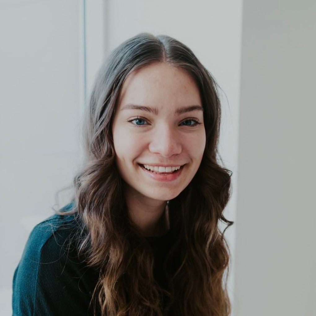
I'm so glad you're here!
My name’s Maria Johnson. I’m a recent business grad with an entrepreneurial mindset, an eye for design, and an interest in STEAM education—all of which culminate in my passion for creativity.
Experience
OES Exhibit Services
Nov. ’24–Present
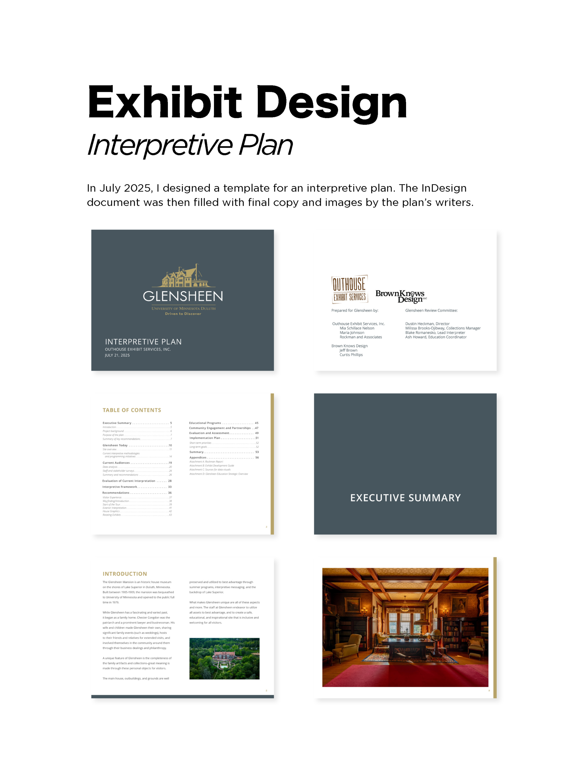
- Providing creative and logistical support for an Exhibit Design studio
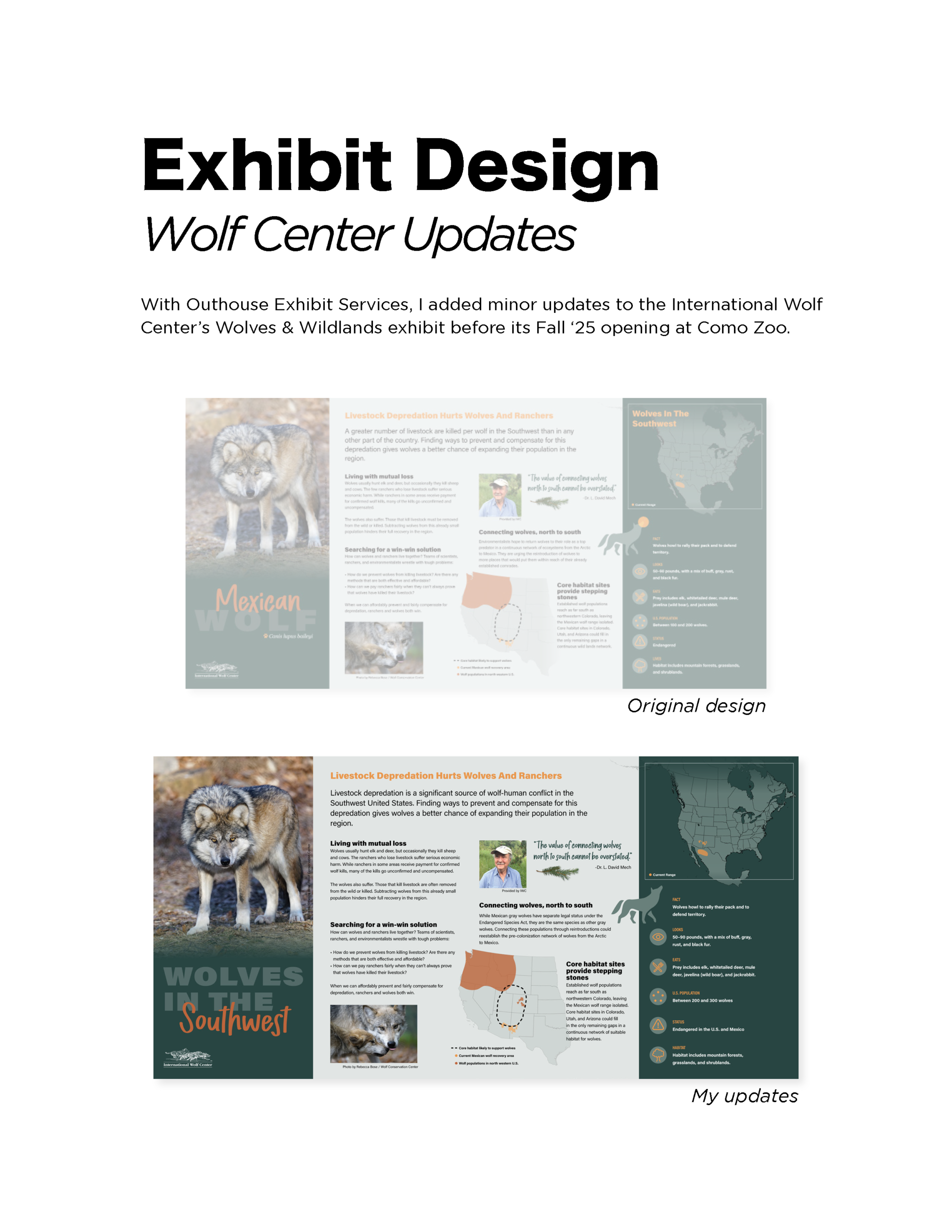
- Updating exhibit graphics, socials, and website
- Archiving digital files and assisting with installations
Lite Run
Dec. ’23–Present
- Assisting in quality studies, human factors-based design iteration, and final packaging of exosuit products
- Programmed in VBA and ZPL to develop an Excel-based barcode label printing system
- Assembling sub-systems and designing guides for the manufacturing department
Playful Learning Lab
Sep. ’21–May ’24
- Co-authored a paper on a computer science course for K-12 teachers of Deaf and Hard-of-Hearing students that I helped facilitate
- Managed financial processes and basic accounting, including reconciliations and payments to 20+ contractors
- Created engaging and inclusive digital learning resources
Skills

Education
University of St. Thomas ’24
BSBA in Entrepreneurship
Minors in Sustainability and Art History
Portfolio Contents
1. UX Design
2. Web Design
3. Inclusive Design
4. Typeface Design
5. Graphic Design
6. Service Design
1. UX Design

Recently, I’ve been working toward a User Experience Design certificate from Google. I’ve just completed my first UX case study for a mock project.
Feel free to check out the prototype and case study below, and reach out if you have any feedback—I’m eager to learn more about and enter the fascinating field of UX Design!
2. Web Design
3. Inclusive Design
Recognizing the need for inclusive STEM education
In October 2023, my undergrad research lab colleagues and I presented at the Inclusion in Science Learning: a New Direction (ISLAND) Conference at Princeton University. For the first time in my life, I found myself in an environment designed specifically for blind and low-vision individuals, who made up a third or more of the conference’s attendees. Throughout the conference, we learned about the urgent need for inclusive design in a world that’s historically excluded anyone who can’t adapt to meet their needs on their own (see the medical vs. social models of disability).
My team was at the conference to present our work in expanding access to computer science education for Deaf and Hard-of-Hearing students. Naturally, I started to wonder what accessible computer science education could look like for blind and low-vision students, including the DeafBlind students our lab occasionally worked with.
Design Considerations
The following design considerations were key to designing each iteration of our solution. These were mainly drawn from my experience working with students at Metro Deaf School in St. Paul, MN, as well as other accessible STEM projects I aided as a student researcher at the University of St. Thomas’ Playful Learning Lab. The product was designed with blind and low-vision students in mind, as they have the greatest need for an accommodating entry to programming.
Equity
How can we give differently-abled students an equitible experience to their peers? Since their peers begin coding with block-based models, we wanted ours to be block-based as well.
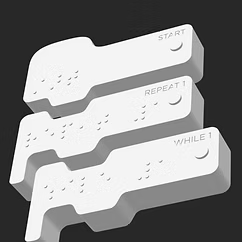
Accessibility
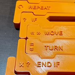
How must block-based coding be adapted to meet the needs of students with limited abilities? Braille, high-contrast colors, and a tactile design suit the needs of visually-impaired students.
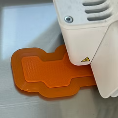
Intuition
How can we make learning the tool easy so students can focus on learning to code? Even with a tactile model, software is still needed to compile code. Thus we plan to create a minimal UI.
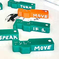
Cost
How do the COGS for hardware and software balance? In the next section, you can see how this drove the change from the second to third prototypes, shifting from hardware to software costs.
Prototypes & Iterations
Your Title Goes Here
Your content goes here. Edit or remove this text inline or in the module Content settings. You can also style every aspect of this content in the module Design settings and even apply custom CSS to this text in the module Advanced settings.
Design I
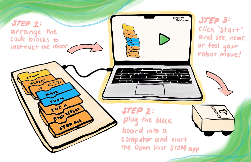
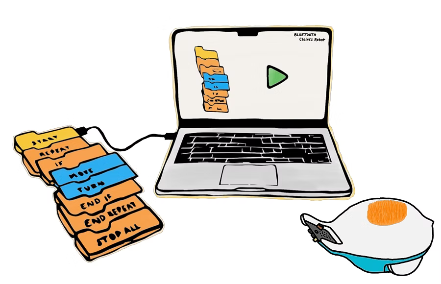
After initial consideration of key pain points, we created the first prototype of our solution. The Tactile Coding Kit, as we call it, brings the popular block programming style from the screen to your hands, enabling an inclusive and hands-on coding experience when partnered with a small robot.
We wanted students to have a simple and intuitive interface, though the product would still read their code and run it in the background. This resulted in:
-
A software program that only requires students to press ‘start’ and ‘stop’ after establishing a Bluetooth connection to their robot
-
A set of commonly used blocks that are sized for children’s hands
-
A board to ‘read’ the order of blocks via NFC tech
-
An unresolved need for customizing capability (i.e., specifying the number of times to repeat a loop)
Your Title Goes Here
Your content goes here. Edit or remove this text inline or in the module Content settings. You can also style every aspect of this content in the module Design settings and even apply custom CSS to this text in the module Advanced settings.
Design II
The goal: how can we simplify the product for users?
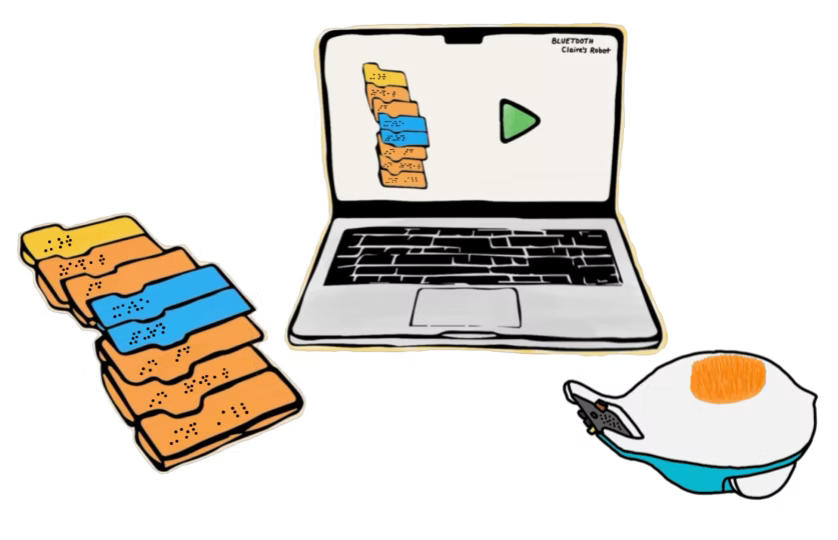
The board felt clunky. Much feedback on the first prototype asked if the board was even necessary. We were advised to look into existing technology to allow the blocks to know their order rather than add an extra communication step to a board. The resulting prototype included:
-
No board – until the technology was further developed, we assume a cord would still be needed to transmit the block layout to the computer interface
-
An off-the-shelf robot to lower our product development costs (the robot pictured is an artistic adaptation of an existing product and is not affiliated with Open Door Code)
Your Title Goes Here
Your content goes here. Edit or remove this text inline or in the module Content settings. You can also style every aspect of this content in the module Design settings and even apply custom CSS to this text in the module Advanced settings.
Design III
A moment of inspiration led to the third and current design; our tech can rely on the software rather than putting electronic components in the blocks. With vision tracking (using a camera to see & read the block arrangement), the blocks can be easily produced at a significantly lower cost.
Now, we’re facing the challenge of designing a software user experience that is still simple, intuitive, and inclusive for students while having a more complex backend. This prototype involves:
-
A web-based software program (because many schools use Chromebooks that are only compatible with web applications)
-
Vision-backed software to “see” the block arrangements via a computer’s camera
-
Solid blocks made of a single material with Braille
Timeline
Fowler Business Concept Challenge
November 2023
SEMIFINALIST
gALPHA
January 2024
COHORT MEMBER
Business Plan Competition
March 2024
SECOND PLACE
e-Fest
April 2024
TOP 25 FINALIST
Next Steps…
While I am currently dedicated to starting my career in human centered design, I plan to continue developing an Open Door Code prototype on the side.
4. Typeface Design
Your Title Goes Here
Your content goes here. Edit or remove this text inline or in the module Content settings. You can also style every aspect of this content in the module Design settings and even apply custom CSS to this text in the module Advanced settings.
About the project
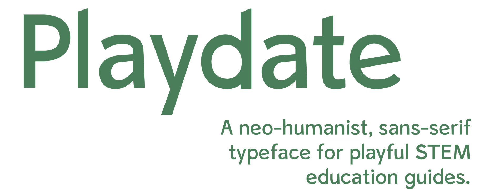
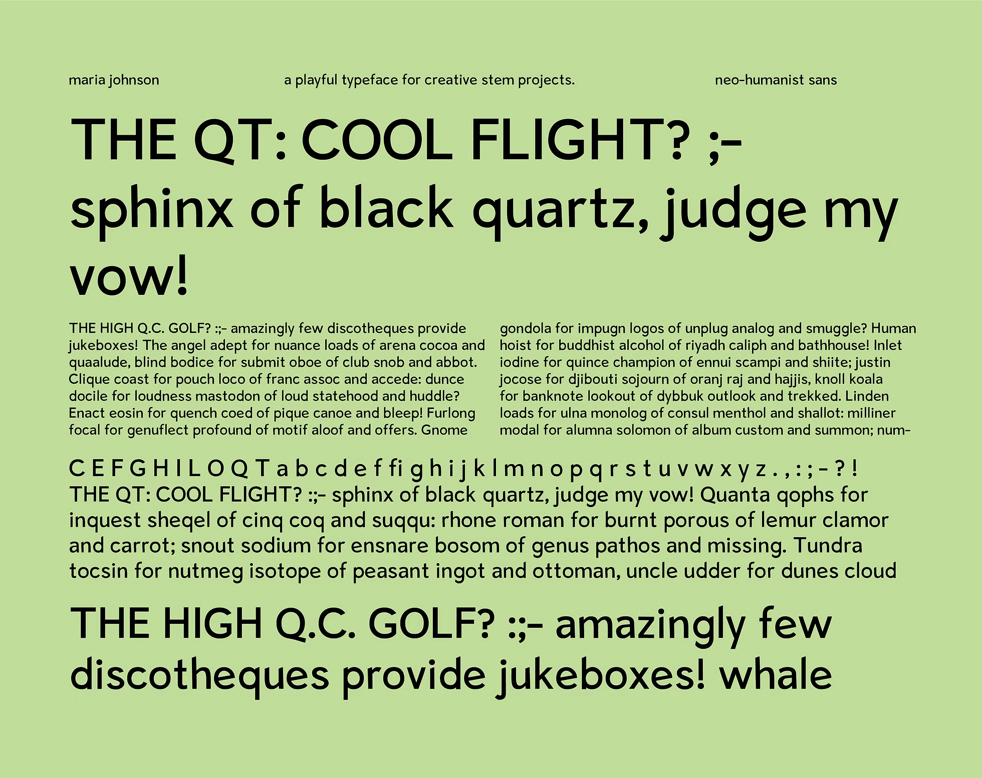
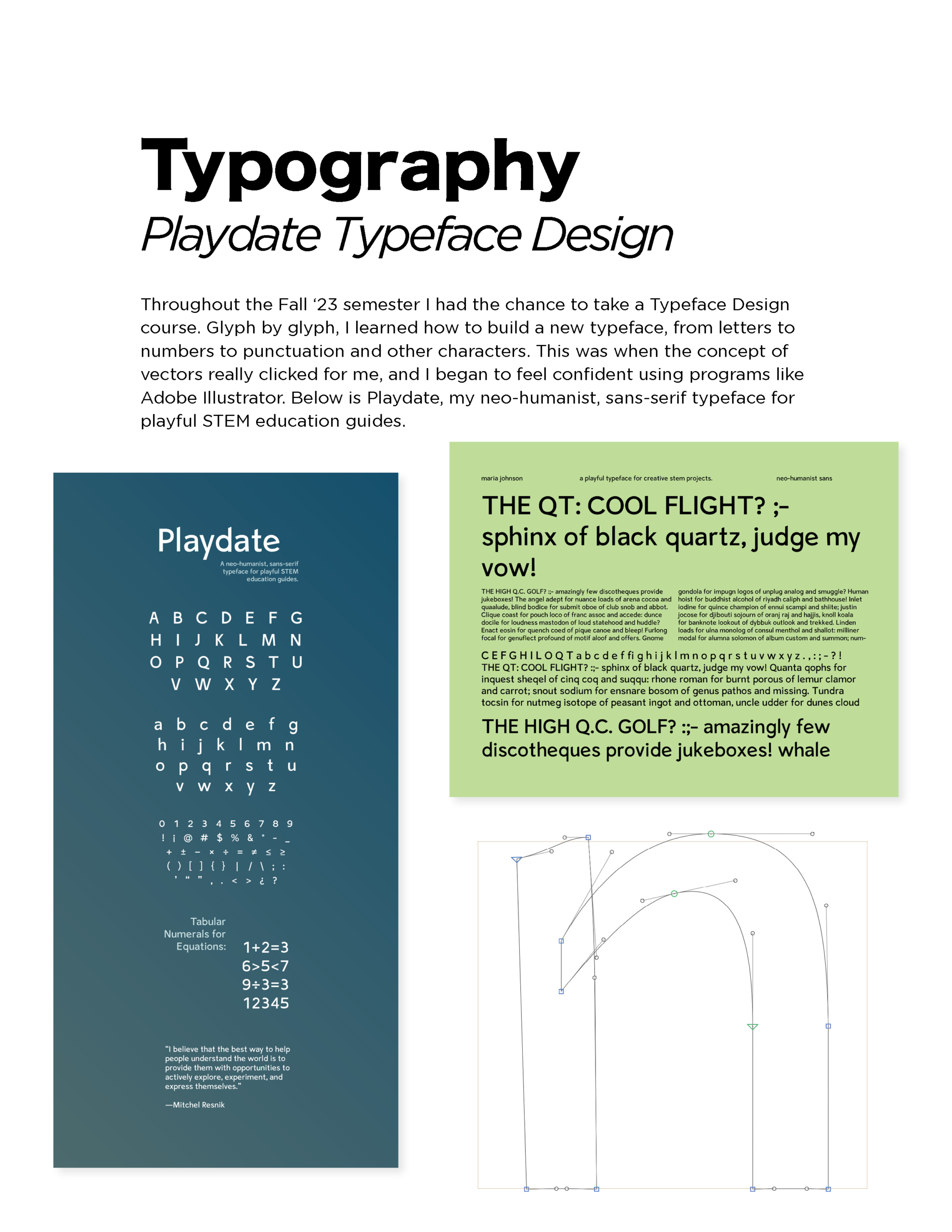
At the beginning of the course we were tasked with creating design briefs for the typefaces we would make. I decided that I wanted mine to be used in playful STEM education applications, as I had designed several of them in my previous work. From there, we each chose an overarching typeface style to guide our designs. The neo-humanist style stood out to me as easy to read (due to its lack of serifs), with enough flexibility in the contrast and weight of each glyph, leaving room to give it a playful feel.
By the end of the semester, I had complete upper and lower cases, punctuation and symbol glyphs, and a limited italic font. I hope to expand the typeface, which I named “Playdate,” with a focus on accessibility. Scroll down to learn more about the design process!
Defining the personality
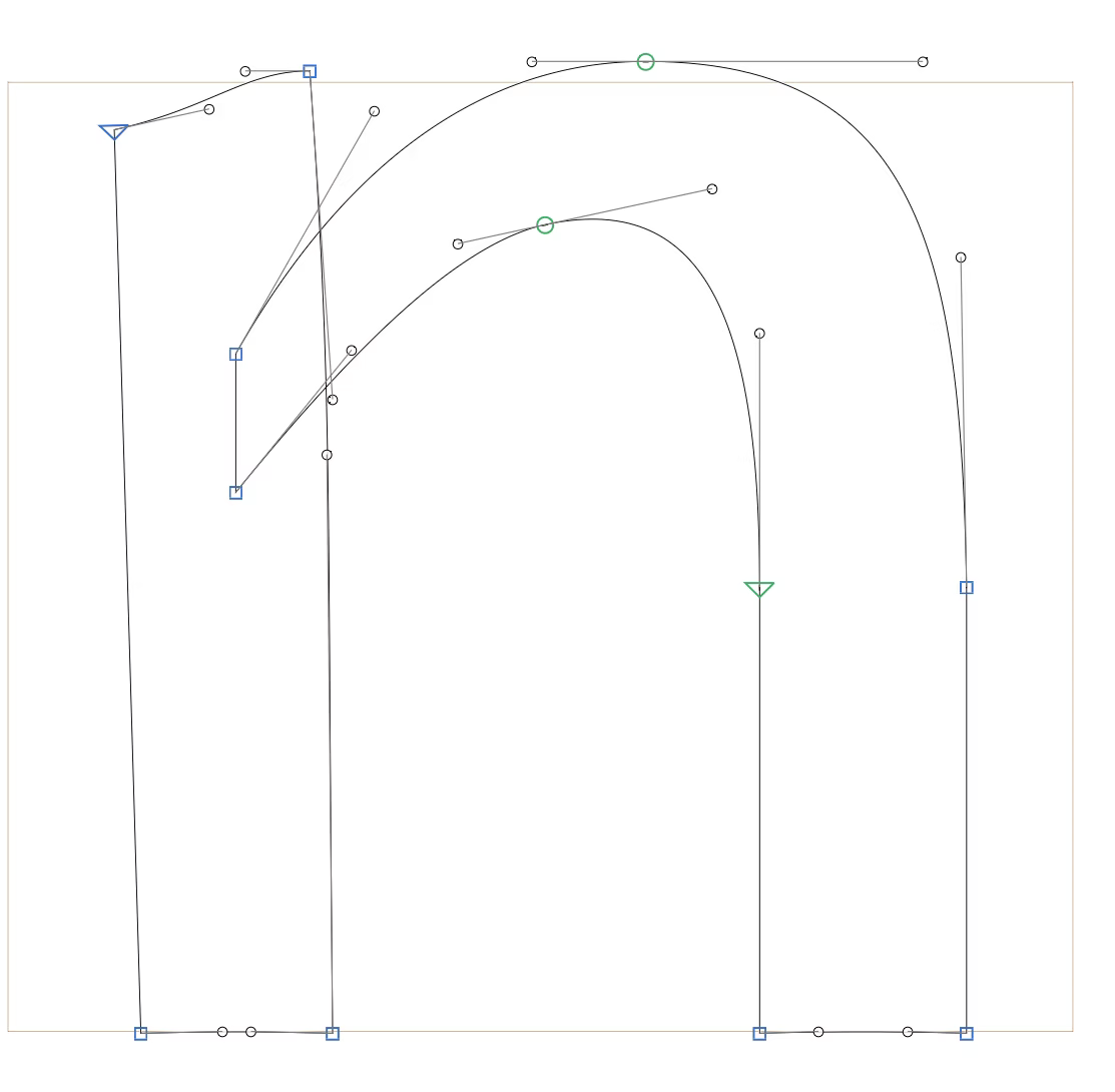
The first two glyphs I designed were /o and /n. These two set the feel of the rest of the typeface. For example, the stem of the /n became the template for /l and /i, while the contrast of the /o was carried through to rounded glyphs like /p, /b, /q, and /g. Most notably, the curve topping the stem of the /n added a subtle defining flair to the typeface, contributing to a playful feel.
Early prototypes
My favorite part of the design process each time I finished a “prototype” of another glyph. With each glyph I designed, more words were available to “test” my typeface with. I would create a “specimen” of my typeface using any words I could each class as the typeface grew. Seeing the letters next to each other highlighted characteristics of each glyph that weren’t cohesive with my design brief or the other glyphs. From here, it was easier to know what steps to take to design new iterations of the typeface.
Number-ing with intention
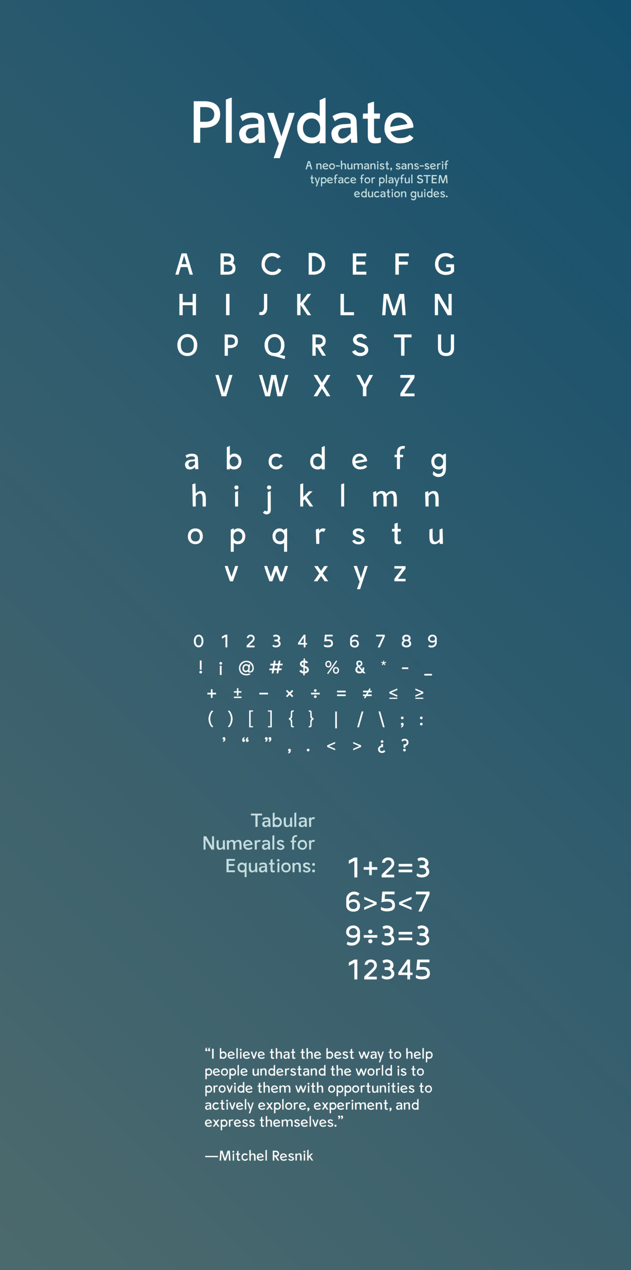
In typeface design, numerals can be designed in a variety of ways. Some typefaces have numerals that intentionally extend far past the baseline, or with varying X- and Cap-Heights. Often, they resemble letters in that the width is unique to each glyph, allowing them to fit together well when typed in a line.
However, none of these techniques seemed to fit my design brief. My typeface would likely be used for math applications considering its STEM focus. It needed to be easy for kids to read as well – I wanted the typeface design to add to their learning experience rather than distract from it.
With these constraints in mind, I chose to design “tabular” numerals and mathematic symbols. This means they line up in columns due to having the same widths and heights. With a tabular design, the typeface can accommodate equations with multiple rows and visually simplify equations for students.
5. Graphic Design
6. Service Design
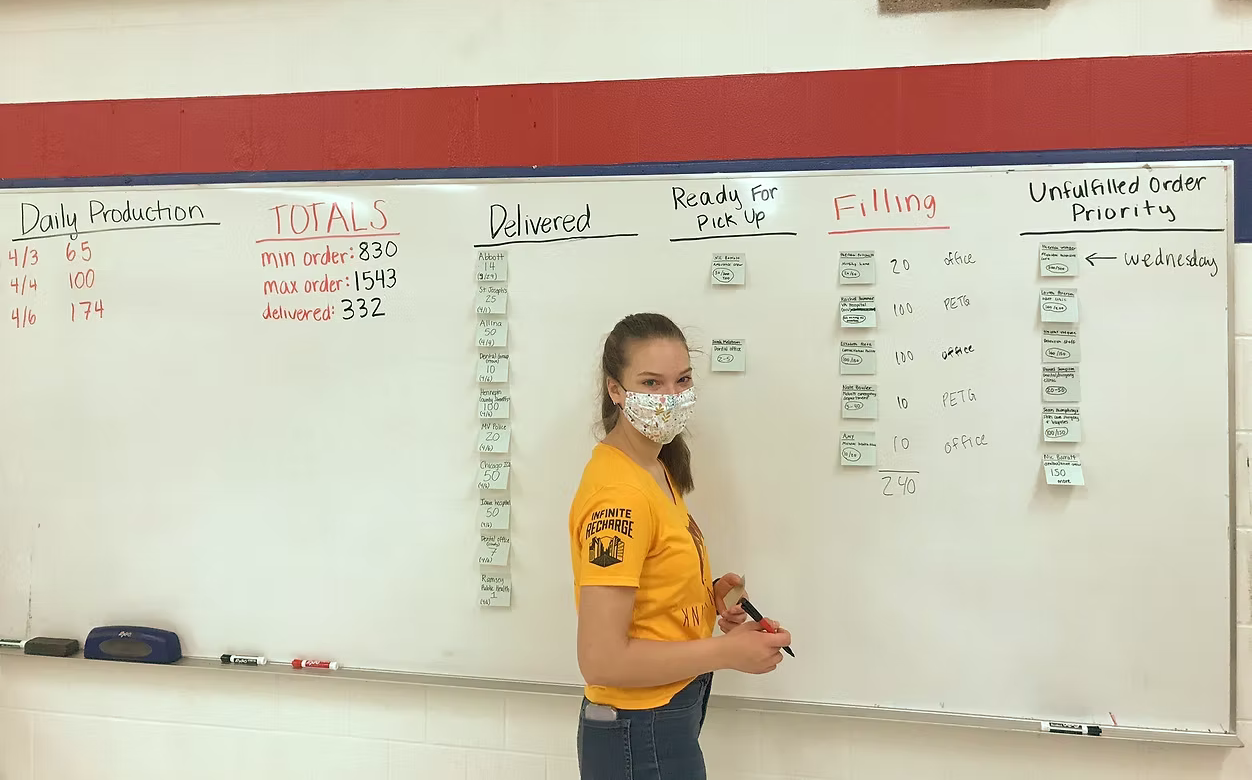
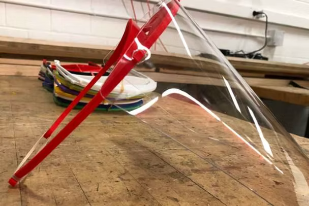
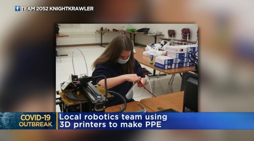
My high school robotics team (FRC Team 2052 KnightKrawler) won the Minnesota Technology Association’s 2020 Tekne Award for the production and distribution of over 25,000 face shields during the COVID-19 pandemic.
My role in the project involved acting as the primary point of contact for the several hundred people who placed orders, facilitating order fulfillment as Scrum Master, and rewriting the landing page of our website to accommodate order placement.
Below is an archive of sorts, documenting the initiative. More information on the project can be found here.